New in Wolfram
Mathematica
8: Financial Visualization
◄
previous
|
next
►
Graphics & Visualization
Create Charts with Non-Financial Data
Analyze any time series with the new financial charts.
In[1]:=
X
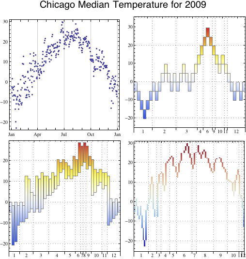
temp = WeatherData["Chicago", "Temperature", {{2009, 1, 1}, {2009, 12, 31}, "Day"}];
In[2]:=
X
pf = PointFigureChart[temp, ImageSize -> 250, AspectRatio -> 1, ChartElementFunction -> ChartElementDataFunction["GradientScaleRectangle", "ColorScheme" -> "TemperatureMap"], ChartBaseStyle -> EdgeForm[Gray], Axes -> {True, False}, Frame -> {{True, True}, {False, True}}];
In[3]:=
X
renko = RenkoChart[temp, {"Absolute", 5}, ImageSize -> 250, AspectRatio -> 1, ChartElementFunction -> ChartElementDataFunction["GradientScaleRectangle", "ColorScheme" -> "TemperatureMap"], ChartBaseStyle -> EdgeForm[Gray], Axes -> {True, False}, Frame -> {{True, True}, {False, True}}];
In[4]:=
X
lb = LineBreakChart[temp, ImageSize -> 250, AspectRatio -> 1, ChartElementFunction -> ChartElementDataFunction["GradientScaleRectangle", "ColorScheme" -> "ThermometerColors"], Axes -> {True, False}, Frame -> {{True, True}, {False, True}}];
In[5]:=
X
datelist = DateListPlot[temp, ImageSize -> 250, AspectRatio -> 1];
In[6]:=
X
Labeled[Grid[{{datelist, renko}, {pf, lb}}], Style["Chicago Median Temperature for 2009", 20, FontFamily -> "Helvetica"], Top]
Out[6]=