Heart Disease Data Analysis
Data analysis is a process of extracting, presenting, and modeling based on information retrieved from raw sources. In this example, a workflow of performing data analysis in the Wolfram Language is showcased. The dataset used here comes from the UCI Machine Learning Repository, which consists of heart disease diagnosis data from 1,541 patients.
Import heart disease diagnosis data and parse it so the rows correspond to different patients, and the columns correspond to different attributes.
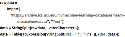
rawdata =
  Import["https://archive.ics.uci.edu/ml/machine-learning-databases/\
heart-disease/new.data", "Text"];
data = StringSplit[rawdata, LetterCharacter ..];
data = Table[
   ToExpression[StringSplit[dat, (" " | "\n") ..]], {dat, data}];
Extract the relevant attributes into "labels" and "features". The values stored in "labels" are 0 and 1, which correspond to presence and absence of heart disease, respectively.
labels = Unitize[data[[All, 58]]];
features =
data[[All, {3, 4, 9, 10, 12, 16, 19, 32, 38, 40, 41, 44, 51}]];Take[labels, 10]For each patient, the feature vector is a list of numerical values. However, the data is not complete and has missing fields stored as  .
.
features[[-3]]Replace missing values by the average of the available data in the corresponding attribute, then visualize the correlation between different attributes.
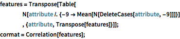
features = Transpose[Table[
    N[attribute /. {-9 -> Mean[N[DeleteCases[attribute, -9]]]}]
    , {attribute, Transpose[features]}]];
cormat = Correlation[features];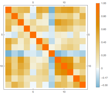
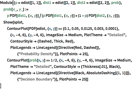
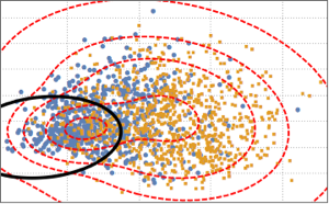
To visualize the distribution of the data, PCA is performed to extract the first two leading components, then the projected data is presented on a scatter plot.
pcs2 = Take[PrincipalComponents[features, Method -> "Correlation"],
   All, 2];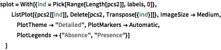
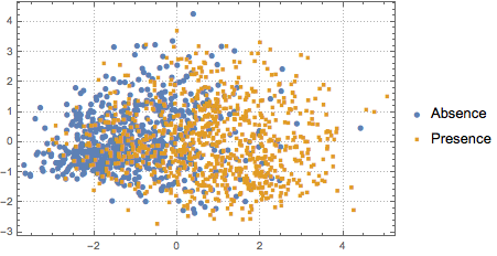
To distinguish the two classes, the projected data is fitted to a two-component Gaussian mixture model.
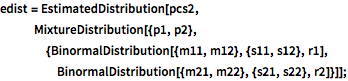
edist = EstimatedDistribution[pcs2,
   MixtureDistribution[{p1,
     p2}, {BinormalDistribution[{m11, m12}, {s11, s12}, r1],
     BinormalDistribution[{m21, m22}, {s21, s22}, r2]}]];
Based on the mixture model, plot the decision boundary (black curve) and probability density contours (red curve) of the mixture model and show them together with the scatter plot. The first component of the Gaussian mixture has higher probability inside the decision boundary.